

Hello,
Hope you have had a good few weeks since I last wrote here.
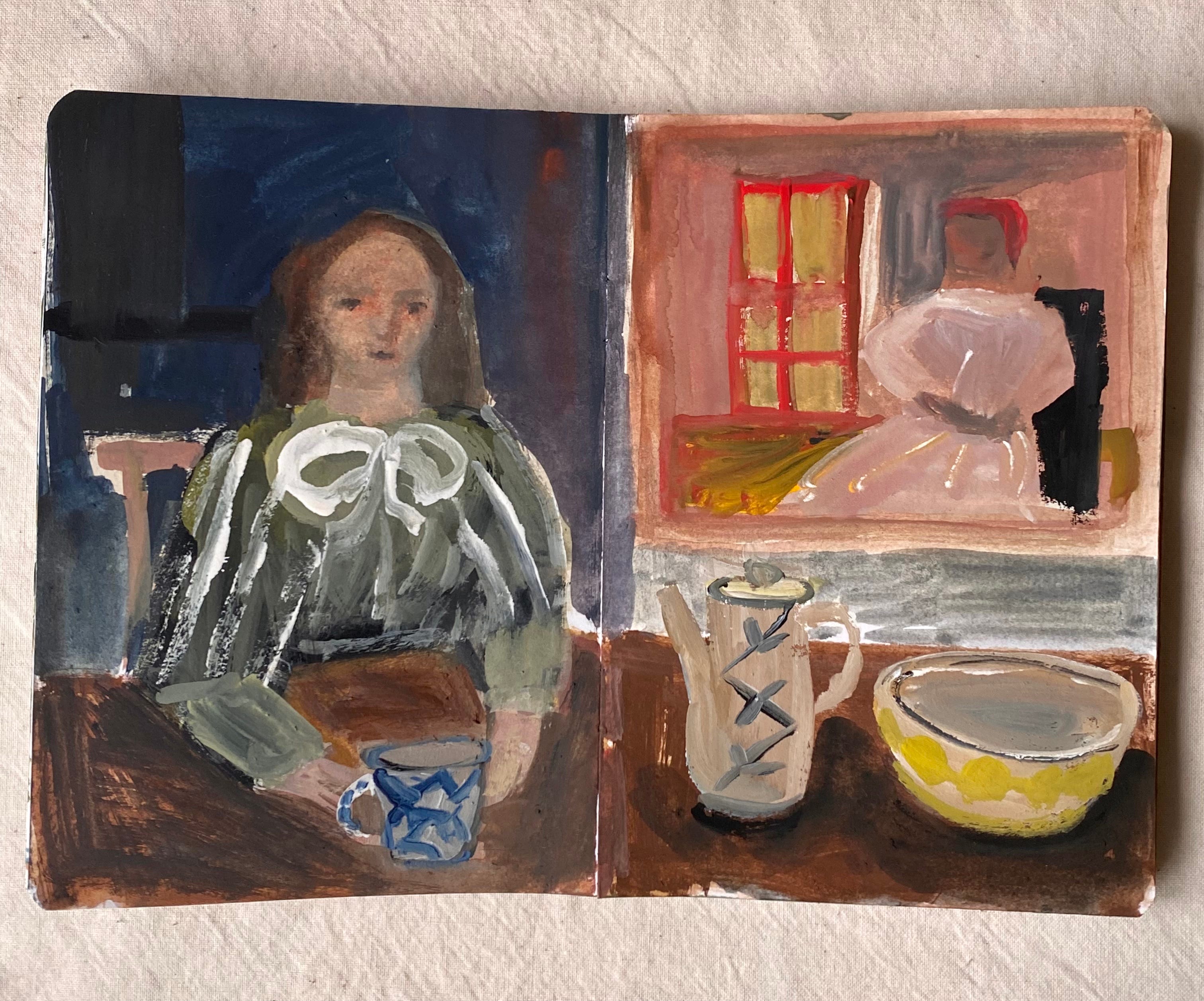
Here’s a recent sketchbook page (gouache on paper)
I am beginning a new series of materials-focused features. Hope you may find these notes interesting.
Gouache:
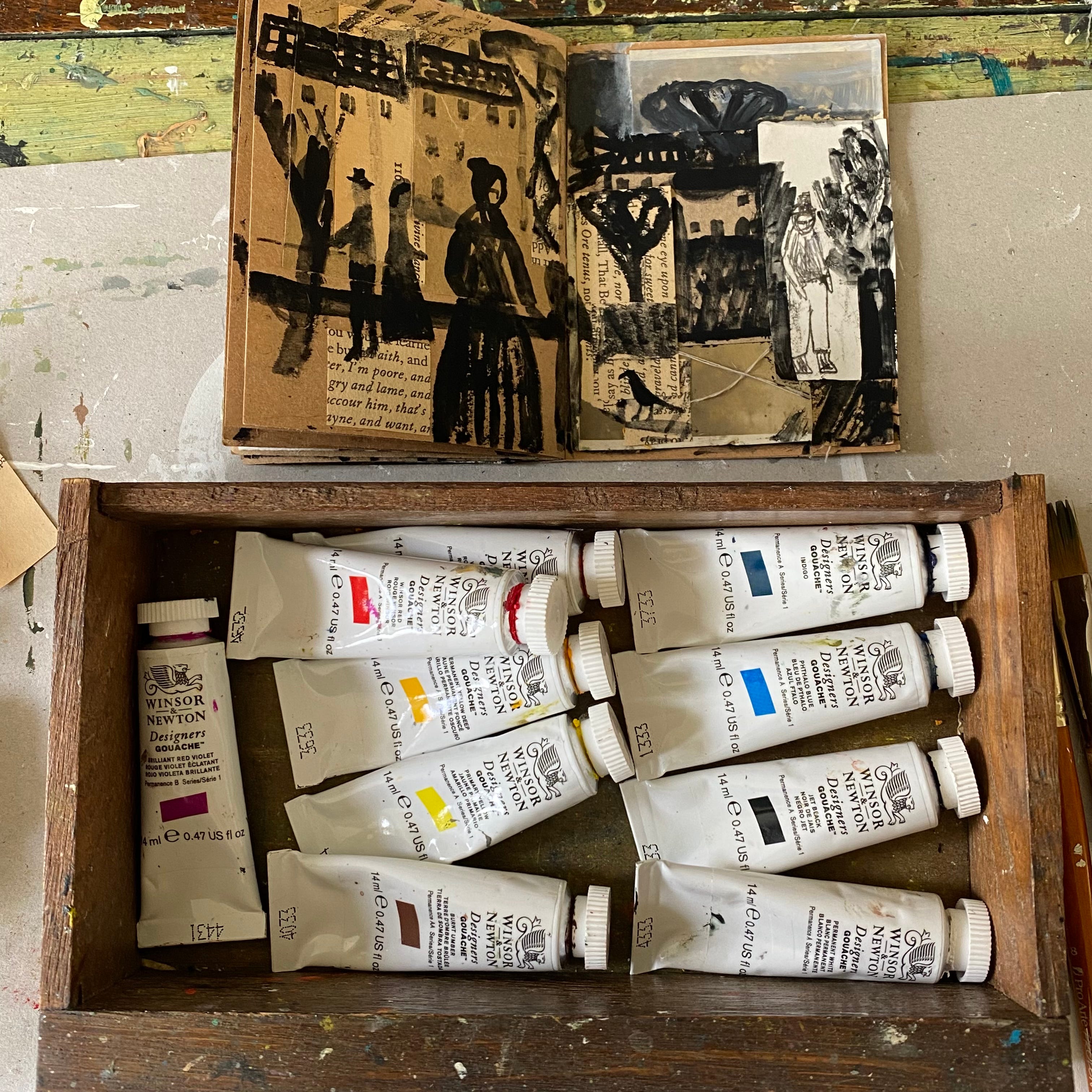
My Basic Kit
I am sharing here a series of notes on my favourite paint medium: gouache. This time I will be discussing my basic kit, the colours I have chosen over time.
Before I begin any discussion - a shiny disclaimer. These notes are my personal sharing and are not intended to be any kind of didactic tutorial. What works for me might not work for you. I strongly believe in learning through action and experience.
Unfortunately, or otherwise, artists often get mistaken for accidental teachers. There is a presumption that if you do something ‘quite well’ you can teach others to do it too. I don’t believe you believe this and I am grateful to you for believing that I am not your teacher. I wish for you to experiment and learn through playfulness and chance. I am happy to encourage and mentor a few people, which is not the same as teaching, in my mind….
My kit - and a recent sketchbook page
But let’s look at paint:
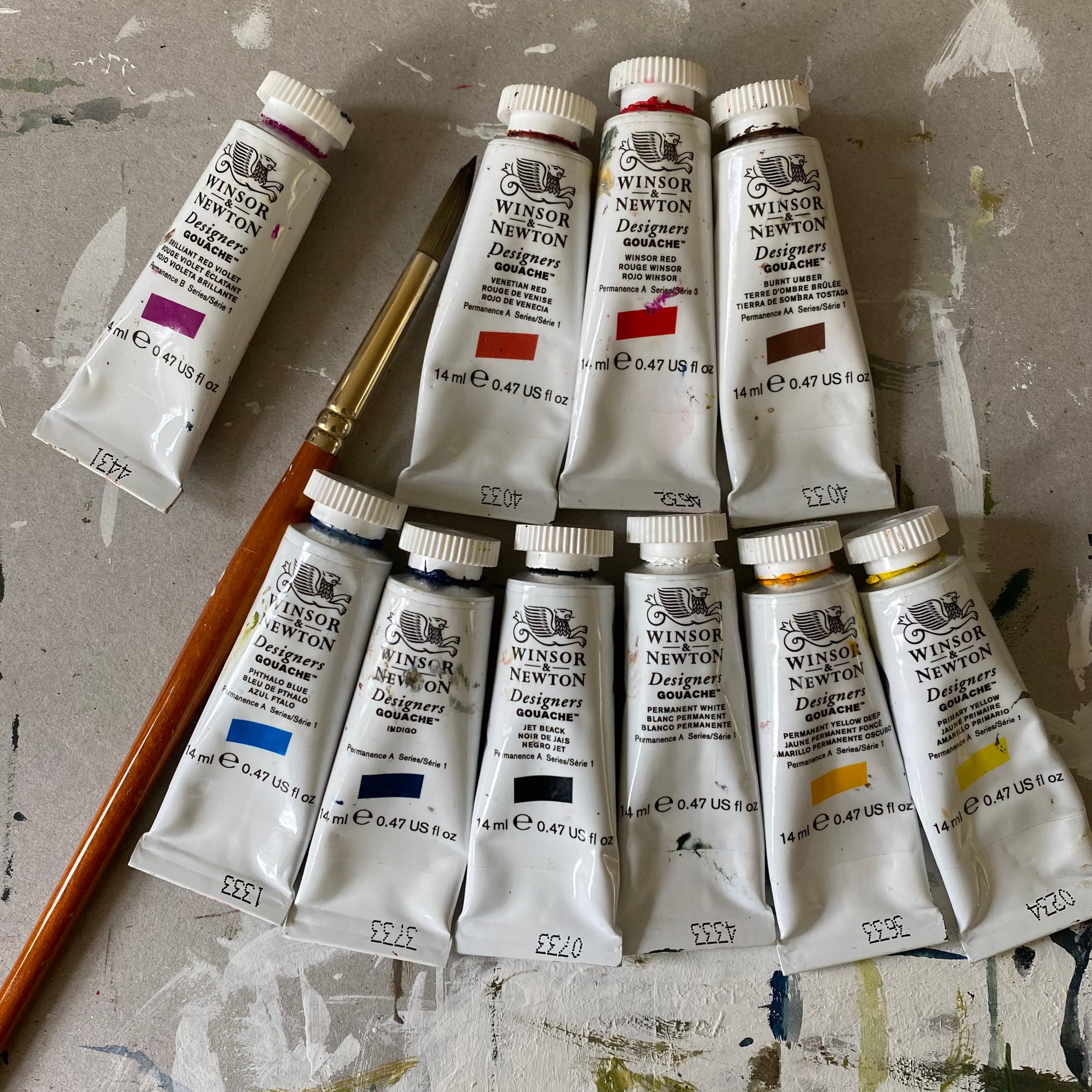
Here is my basic kit of gouache paints. You can see I stick with one brand: Winsor and Newton designers gouache. I have used this brand and dabbled with others but this is it for me. They work for me and I have no desire (or budget) to experiment with another. They are professional quality, I know them, I can tell the colour from smelling the tube blindfolded (well perhaps not all of them).
I was not taught to paint using gouache. At school I was given some instruction on using powdered poster paints, watercolours and acrylics. These are all quite similar but not the same. All I know about gouache painting has come from working with them, in many different and often random ways, over many years. I will talk more about surfaces for paint and more in future notes.
It was not a conscious decision to make gouache my primary paint. It just happened that way. I thought, for many years, I was a watercolourist. Or did I? I like watercolours but I wanted to layer and change my mind, make a more opaque world. I found myself buying a few tubes of gouache paint, trying it out, mixing it with watercolours and soon the gouache became the dominating force. Well, anyone who has mixed these two will know that despite their commonality (both water-mixable paints) they behave differently. Gouache is a bit of a thug compared to watercolour. You have to keep it under control when mixing the two together. It can be done, of course, very successfully.
Over time I have explored a variety of colours and purchased many, many tubes of gouache in all shades. But I knew, I always knew, I wanted to have a basic kit and to feel some freedom in knowing that I had just enough and that if I had to move about, set up a workspace at any table, I could keep the colours I needed in my pocket. Or a very small drawer.
So, I decided upon and selected (after much experimenting and debating) two particular reds, two blues, two yellows - and of course white, black - and just one brown. For a while I did not allow myself any colour beyond the primary, but over time it has made practical sense to me to have that burnt umber in my kit.
jet black
permanent white
permanent yellow deep
primary yellow
phthalo blue
indigo
winsor red
venetian red
burnt umber
Technically, if you look at my choice of reds, you might think that Venetian red is a bit of a brown. It certainly is opaque and terracotta-looking.
You may note I do not have any greens. Which is perhaps interesting, especially as green is a colour that takes up a lot of space in my work and mind. It is one of my favourite colours, which is why I prefer to mix it. Through the action of mixing other colours to find green, I am rediscovering it over and over. I will share more on mixing colours in the future.
If, as is always possible, I needed to make this selection smaller - my pocket shrank - then I would of course have just one red, one blue, one yellow, black and white. And I think I could do that. It would still be possible to paint and enjoy painting.
If you have never used gouache or would like to give them another go - then yes I suggest starting with a very basic set of primary colours.
(Now you can see there’s one tube I don’t include in my kit - brilliant red violet - poor dear is kept to one side a bit as I rarely use - but to be fair and open I will say yes I do possess this shade and will, when necessary use - but this is only for certain colours in flowers, for example, that I would not otherwise reach for….)
If I had to choose just one tube of paint - no prizes for guessing - I would choose black. Indeed, I have often wondered if I could spend an entire year (or maybe a month) working with just a tube of black gouache paint and whatever papers I can get my hands on. I would cope just fine. And yes of course, I do believe I would miss colour. I would probably, yes very possibly, need a tube of white paint. And then need a tube of - the next would be yellow.
If you have black, white and permanent yellow deep - somehow that makes a pretty good mix for me. You can make a decent almost green/grey. You can make a multitude of shades.
Next time, I will share more about these colours and how they play with each other (nicely, or otherwise).
**
A few notes from this week
doves building nests in the overgrown conifer. a dove out foraging for twigs encounters a huge bumble bee, bats it away with a fearless nudge
/
distracted by birds, filling up the seed feeders, watching starlings in the bird bath, magpies and a crow hanging together on the garage roof, out early with their eye on who has left the sparrows’ nest - is baby bird their oyster?
/
almost stepped on a slow worm. My shadow makes it zig-zag, I imagine with some annoyance, as I disturb its sunbathing
/
shoulder pain wakes me most nights, but I am safe in my own warm bed and am grateful to have the luxury of adjusting a few pillows
/
zinnias germinate so easily, such a simple pleasure, meanwhile the bargain basement surprise mix of houseplant seeds is a curious thing and I am sure I should be doing more but so far two seedlings is better than none
/
in one day: I want to just work abstract, black and white with a hint of colour /everyone things I am crazy anyway/ oh but oil pastels I need more colours / a series of portraits / lots and lots of tiny books / I am just going to sit here and read this book until / I need to tidy up / I am not crazy, just determined and a bit tired
**
Thank you for reading, for subscribing and sharing. I would appreciate your feedback very much, simply a like or a comment - you can also email me (there’s a contact link via my shop). If you enjoy reading these studio notes please consider buying me a coffee, it does help so much! Thanks to everyone who has generously helped with their support.
Thanks as always for your studio notes. I’ve had the revelation this year that I’m not a teacher but a sharer of creativity and it’s helped me open up to the idea of hosting (not teaching) workshops in my studio again. It’s funny how it takes time for things to dawn on me, then seem so obvious…I’m not a teacher and that’s ok ☺️
This was such a great read! I love hearing about your materials, both the practical considerations and your personal preferences. There is always something to be learned and this is just the nicest way, hearing it from someone whose work I admire and who is so generous and communicative. I look forward to reading your other posts about materials. I also love your collected notes at the end. Those little snippets contain worlds of small wonders, truly some of the simplest treasures of life. I certainly hope that your shoulder heals and stops waking you at night. ❤️